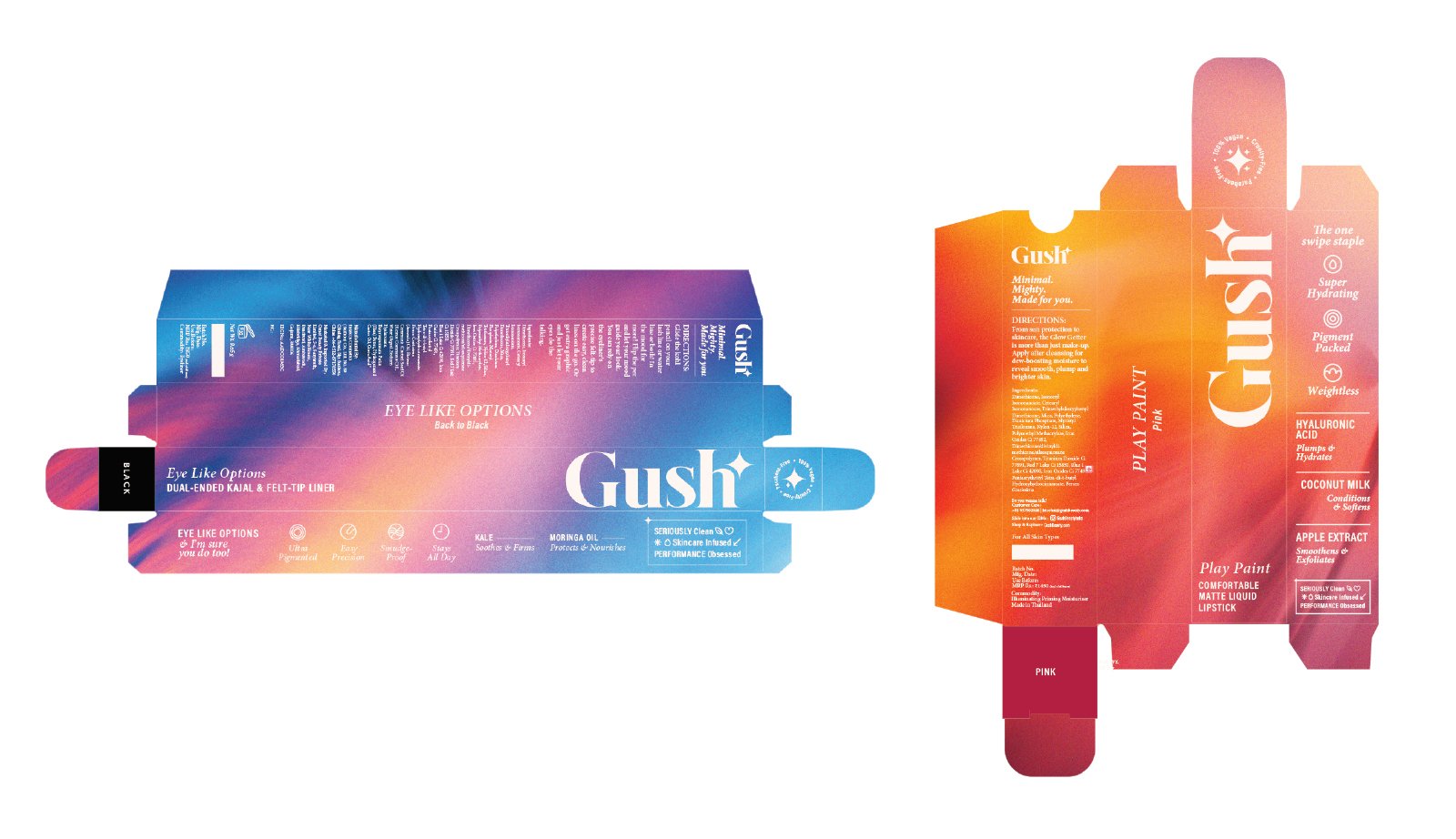
Designing a striking packaging for the always on girl.
Interpreting the name ‘Gush’ - The everyday excitement of feeling good, being on the go, the satisfying rush of looking good with ease.
The blurring is visually representative of soaking in life, beauty and energy. The gush girl is not conscious about herself.
She is outward looking focusing on collecting fun, experiences with friends rather than being held back by how to present herself.
Role : Art Direction, Design
Design Team : Amrita Mohanty, Kavya Narayanan


